DISCLAIMER: To comply with my non-disclosure agreement, I have omitted confidential information when writing and sharing this case study. All information is my own and does not necessarily reflect the views of the Disney DTCI Team.
About the Project.
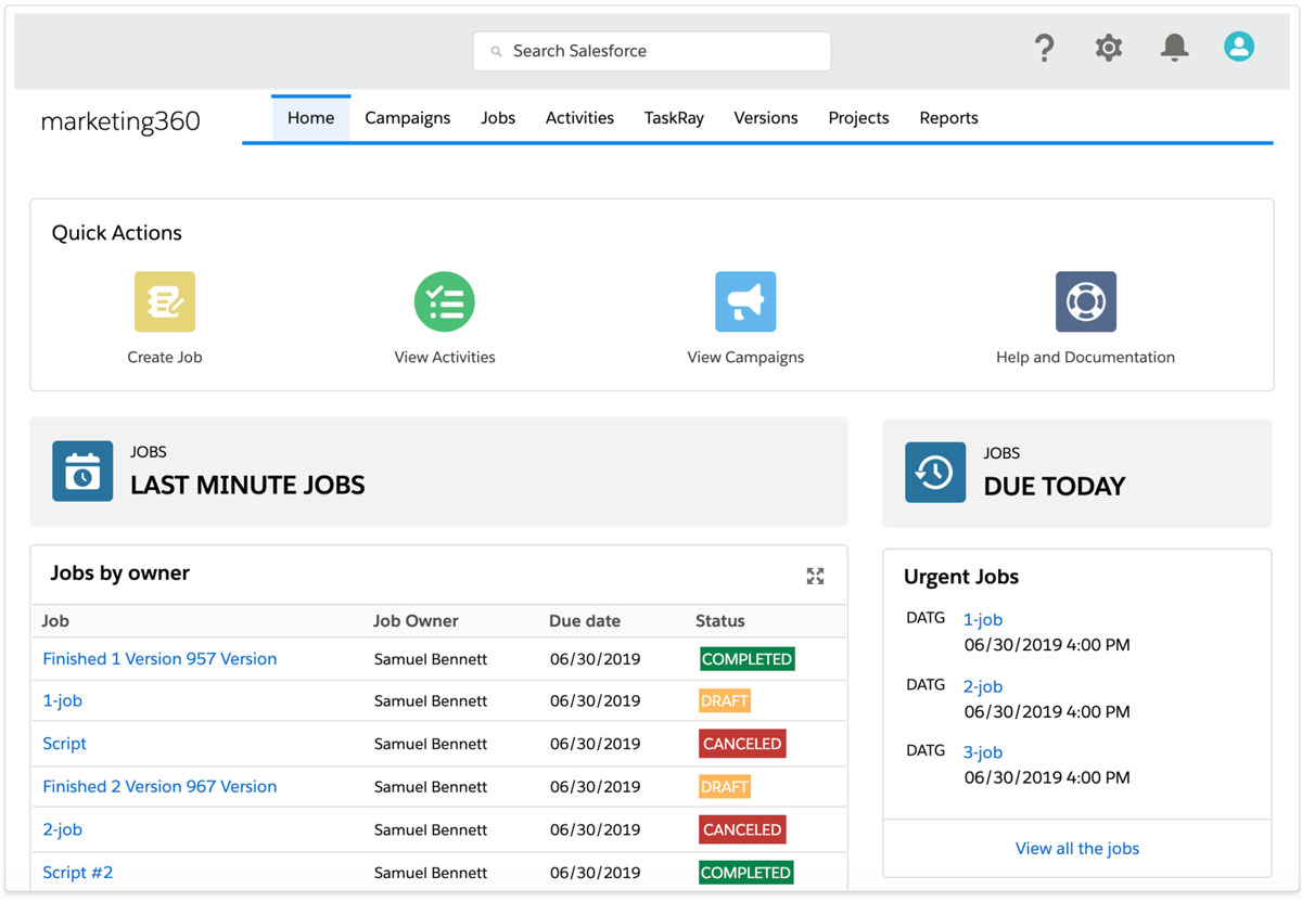
The project consists of designing and creating a modern enterprise marketing platform with tools for Marketing teams across Disney’s Business Units and Organizations to support their marketing planning, operations and creative workflows globally.
Client
Year
2019 to date
Deliverables
- Heuristics Evaluation
- Salesforce Implementation Assessment
- Product Enhancement Features
- Mid to High Fidelity Prototypes
- Design System
The challenge
Align the marketing operation and communication across disparate marketing teams, while scaling the product to support the evolving The Walt Disney Company marketing landscape.
My Role
Right at the Discovery phase my role consisted of supporting the team with a series of Product Assessment activities, which included a Heuristics Evaluation, an Information Architecture Analysis, distilling the observations found during the Discovery phase and turning them into insights that served as the base for the ideation and product recommendation sessions. I also participated in the product prioritization sessions. Then I designed the prototypes as part of the final proposal sent to the client. At the end of the Product Assessment phase I took ownership of the project’s UX side of things and led the Design and Validation strategy when working with the dev and technical team when providing new features along the way.
Main Tasks
- Heuristics Evaluation
- User Insights and Ideation
- Feature Prioritization
- Prototyping Product Enhancement Features
- Design Execution and Validation
- Design System
The Design Process
The project was initially intended to fix underlying issues with overall usability, but it evolved into a much larger scope and the UX Design needed to keep up with this situation.
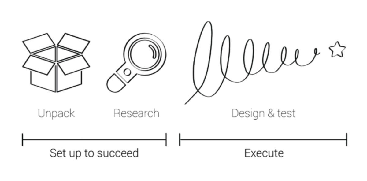
The overall Design process consisted of:
- Providing quick wins for usability improvement (Short Term Solution)
- Scaling up and providing product enhancement features to support the long term product growth (Long Term)
Design and Research Toolkit
The main artifacts, tools and activities chosen for the task at hand.
Adobe XD
Usability Evaluation
Interviews
Information Architecture
Lightning Design System
Avonni Creator
Product Assessment
An in-depth exploration and comprehension of not only the salesforce platform instance but other platforms used by end users.
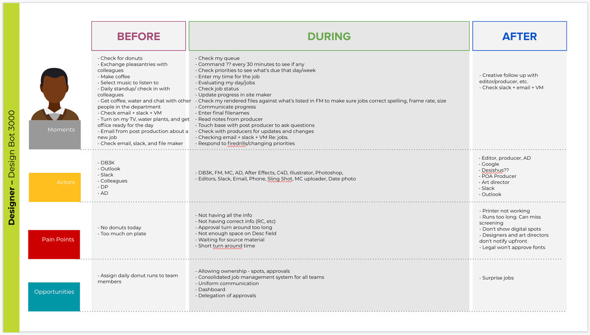
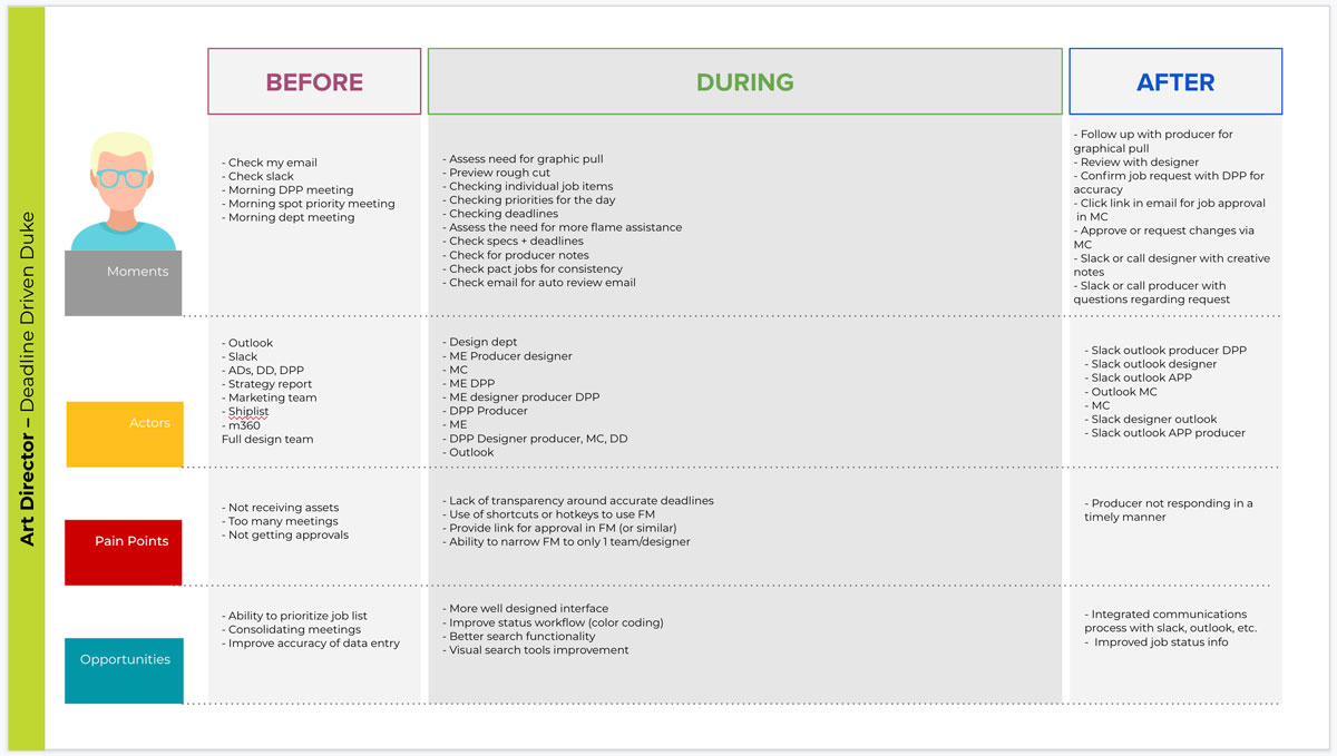
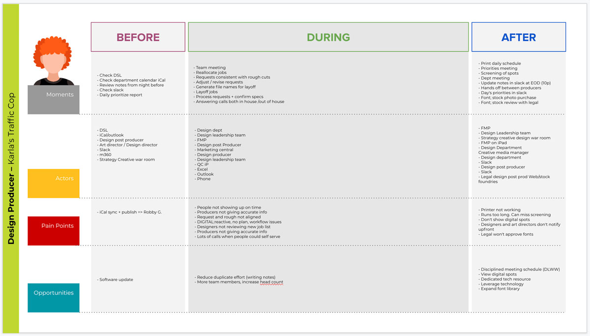
Customer Journey Maps
On-site observations and understanding of the way users perform their tasks and the problems they run into.
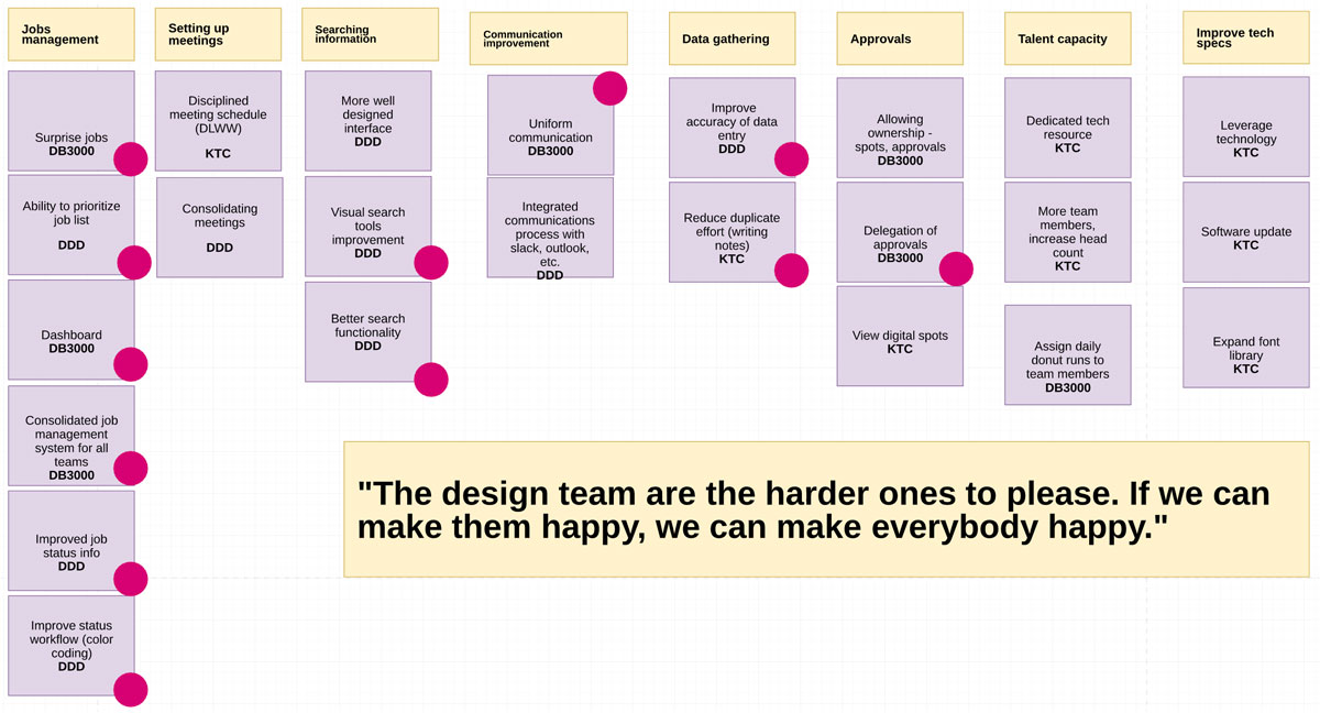
Top findings
Categorizing the observations and finding common patterns and themes.
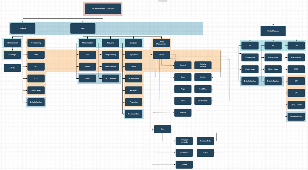
Information Architecture
Mapping the hierarchy and relationship between main objects on the Salesforce current implementation.
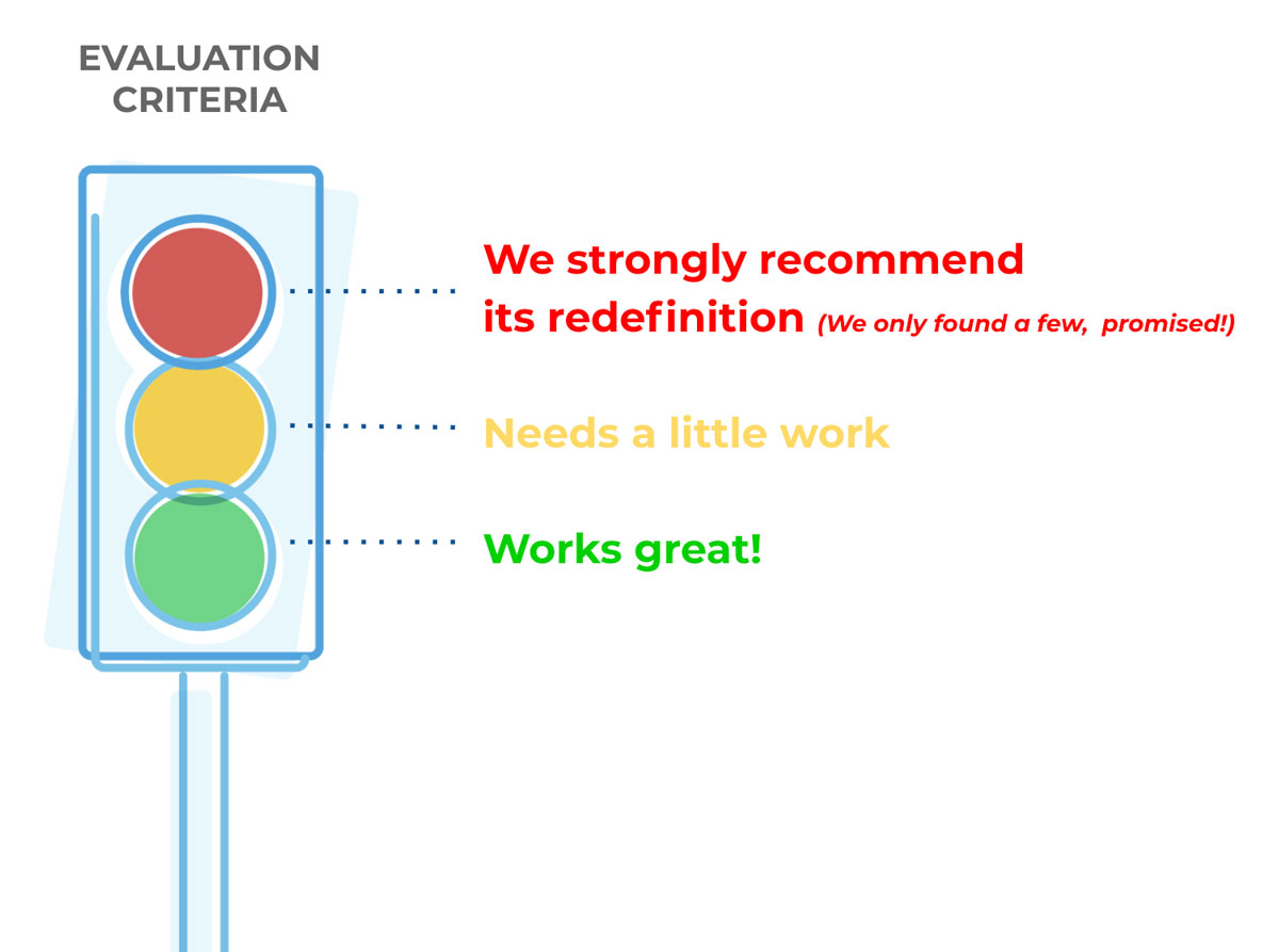
Heuristics Evaluation
I examined the interface and judged its compliance with the 10 usability principles.
Usability Improvement Recommendations
All recommendation were validated against the business goals and by the technology constraints, and it provided an input to be used for development and implementation.
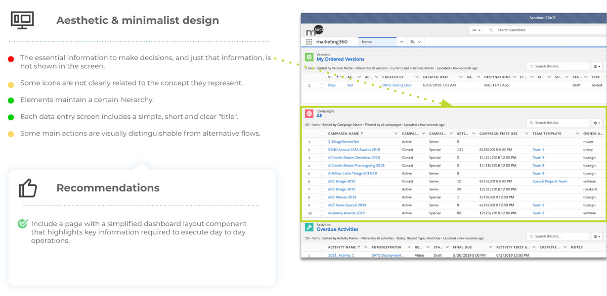
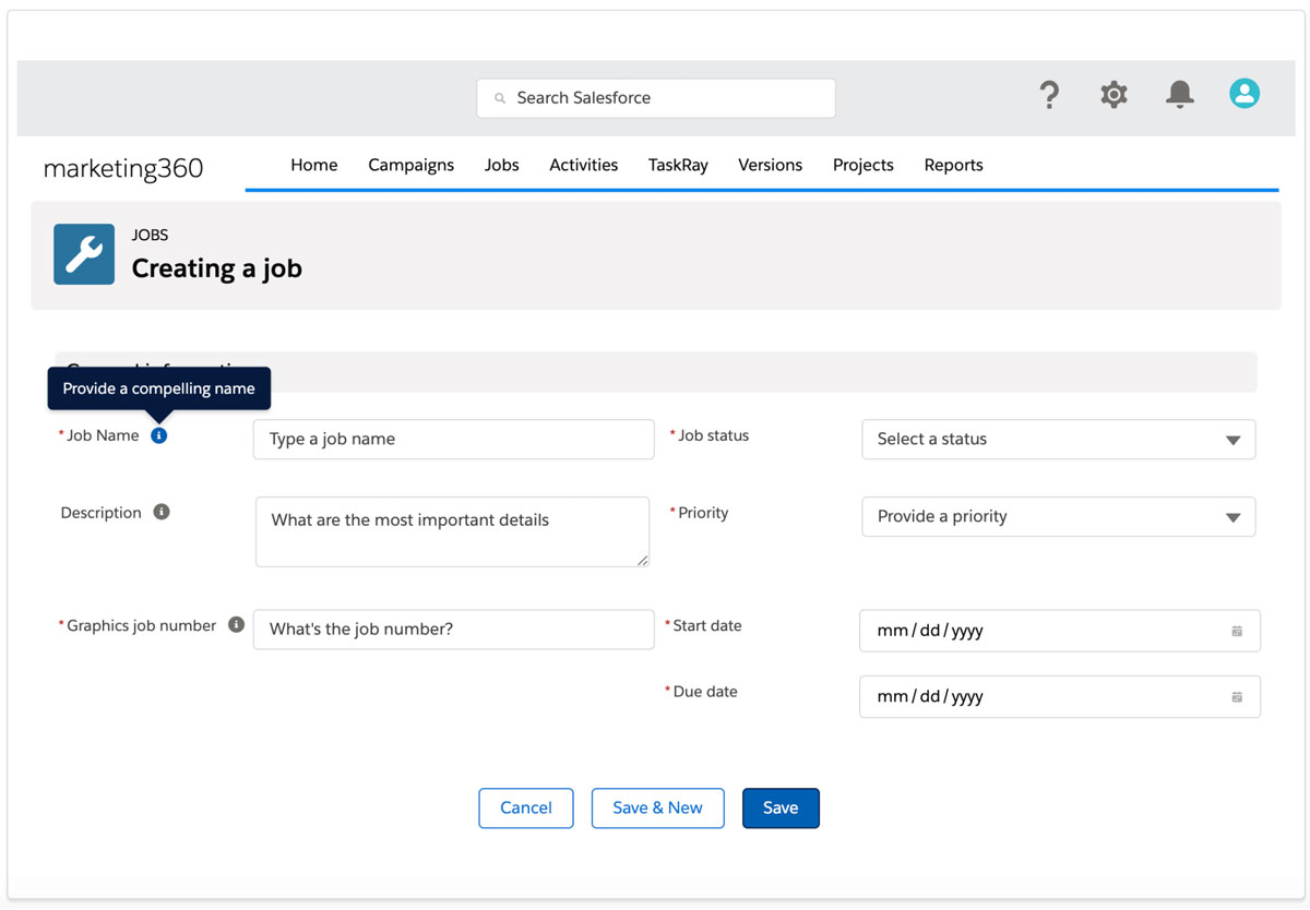
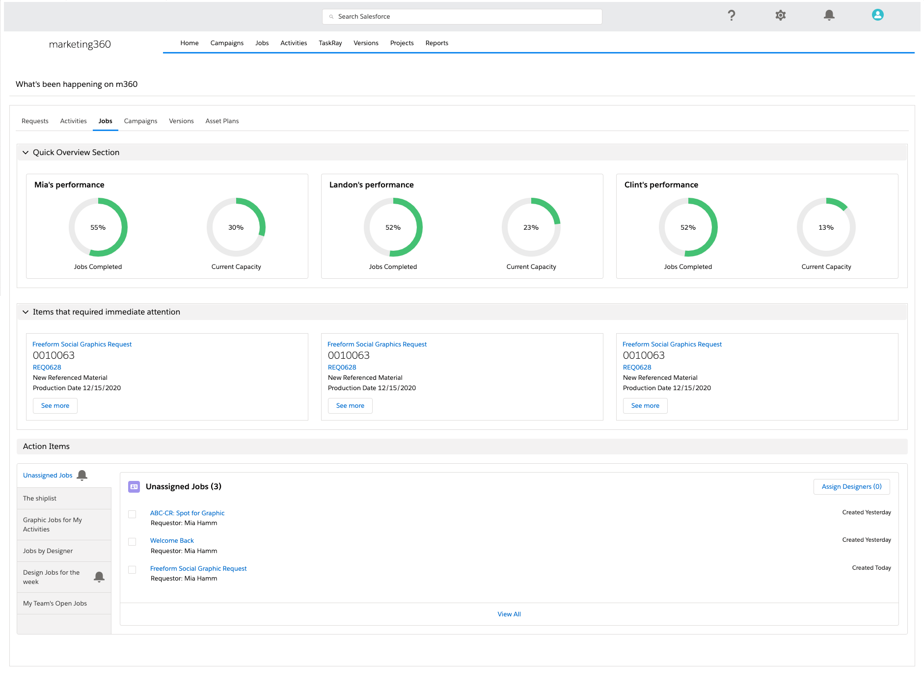
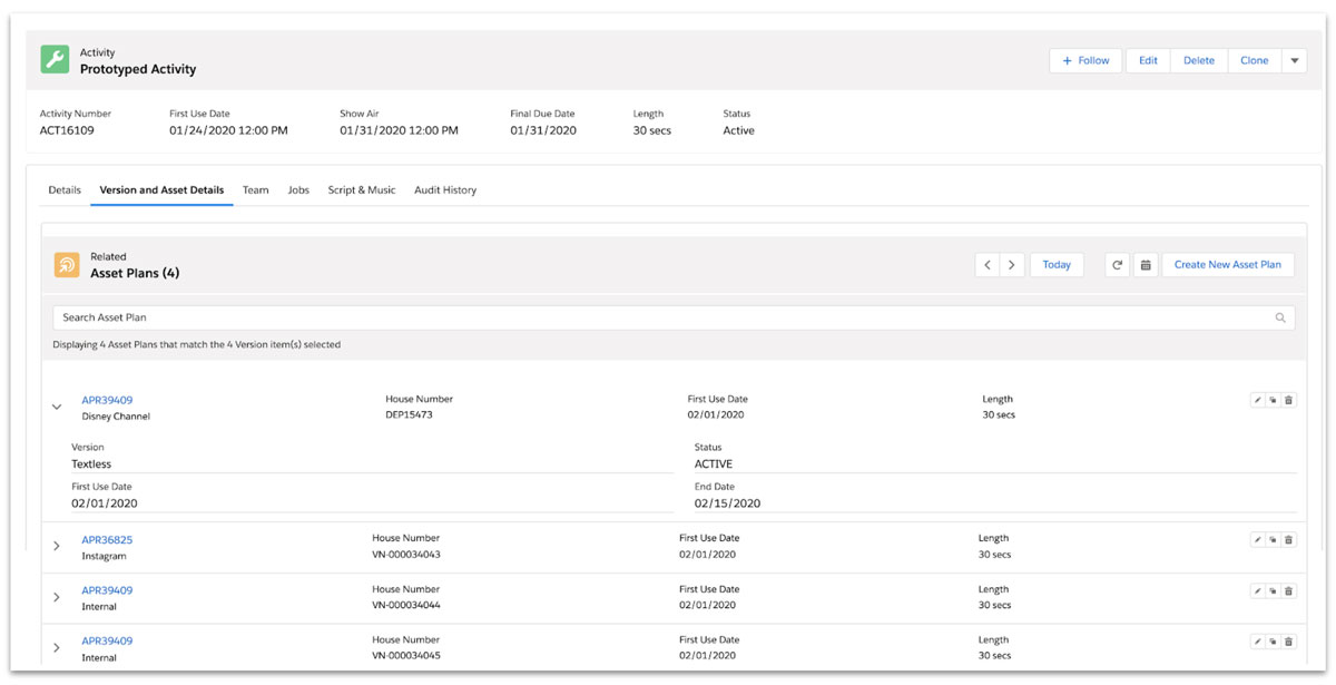
Prototyped Solutions for quick wins
The prototypes were designed to introduce the quick wins that could be implemented within 1 month timeframe.
They illustrated part of the quick wins recommendations required to improve the user experience.
Short Term Solution Design
Design Sprints
An agile framework to quickly validate and deliver design solutions. All proposed solutions were validated, tested and ready to be implemented by the dev team one sprint ahead.
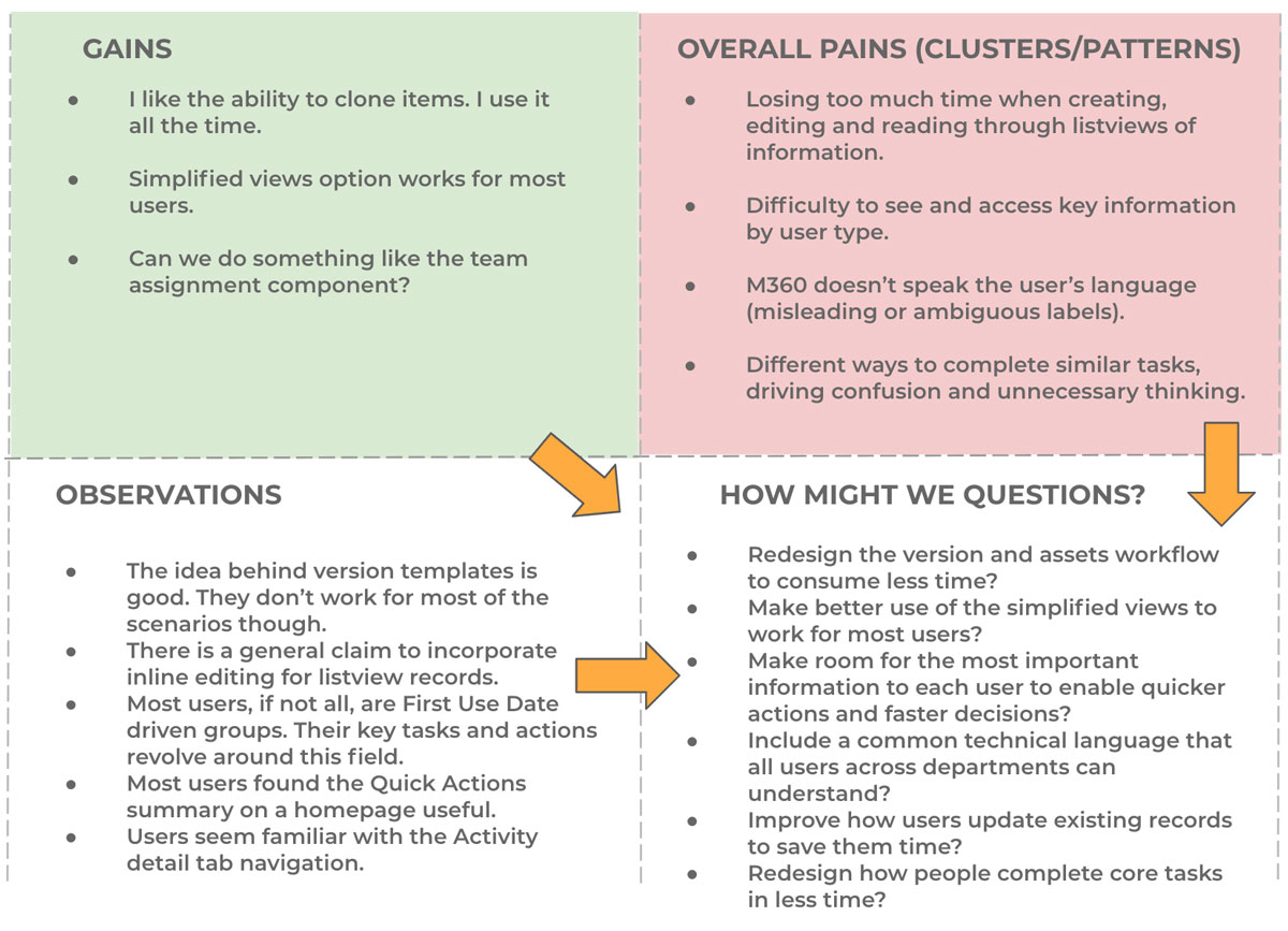
Design Questions
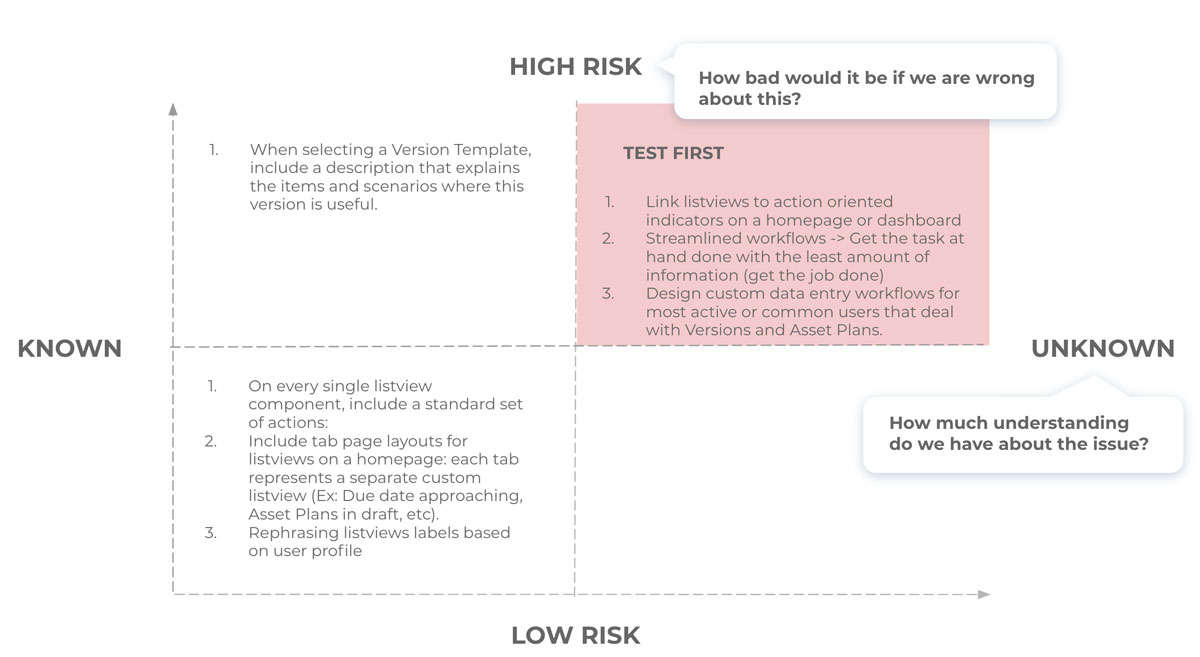
How might we questions helped us reframe the problems overall pains that needed to be improved, and set a solid foundation for the ideation phase. We then prioritized and picked the most critical features that required to be tested in order to validate our initial assumptions.
Quick Design Iterations
We provided several design solutions and exposed them in front of users to quickly validate and gather feedback.
Scaling up and delivering long term solutions
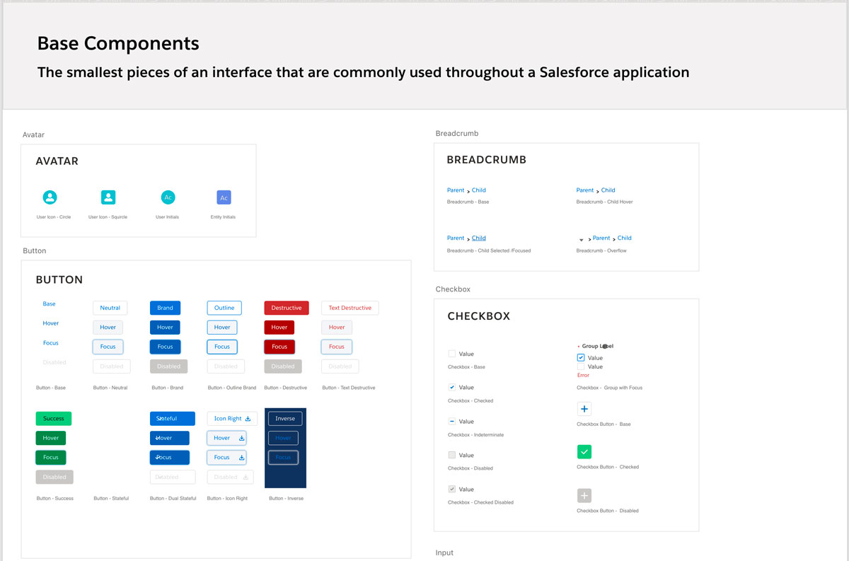
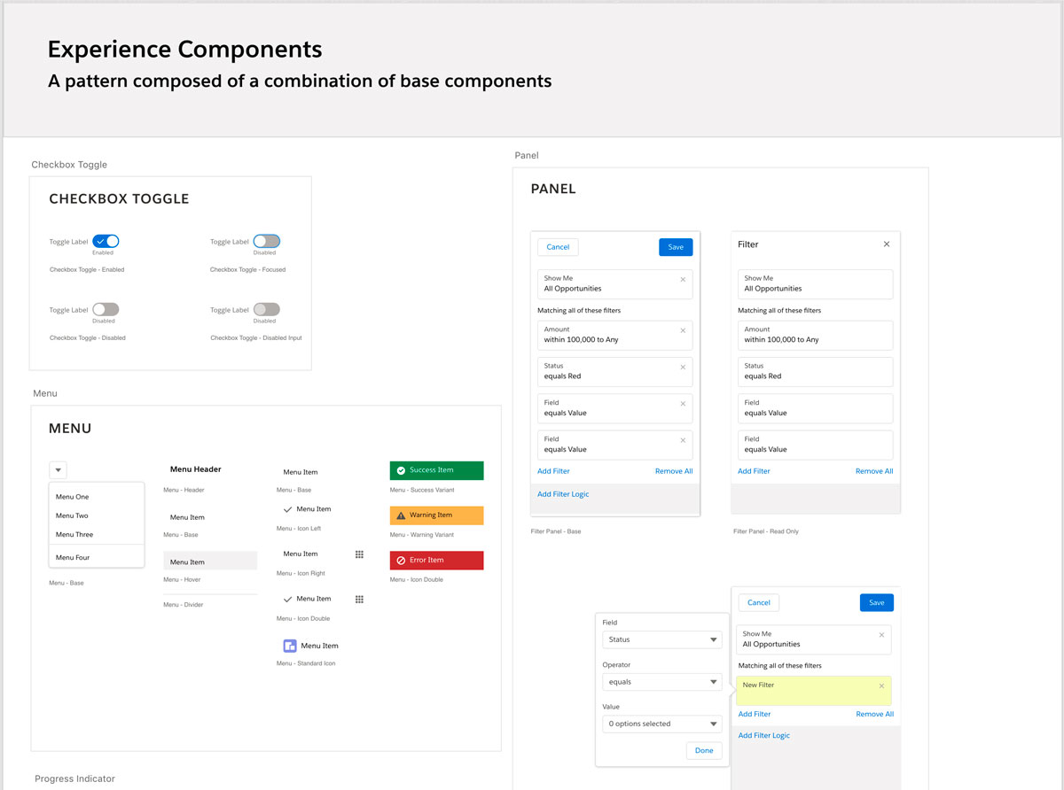
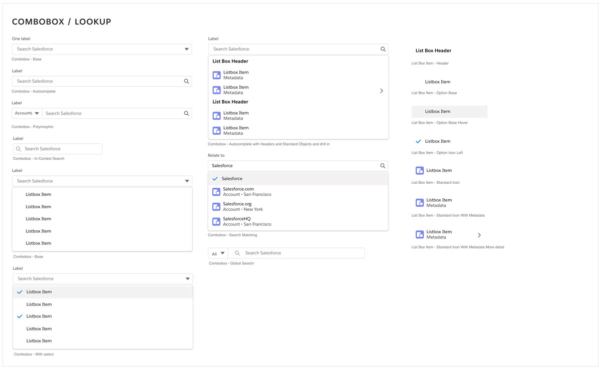
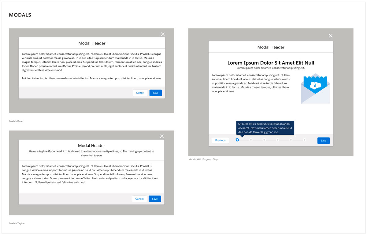
As the user base kept growing and more business units were onboard to use the platform, we needed to deliver even more features within the same sprint timeframe without compromising quality. So I put together a Design System that enabled us to deliver solutions at a faster pace.
The result
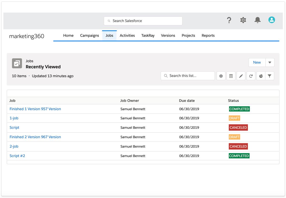
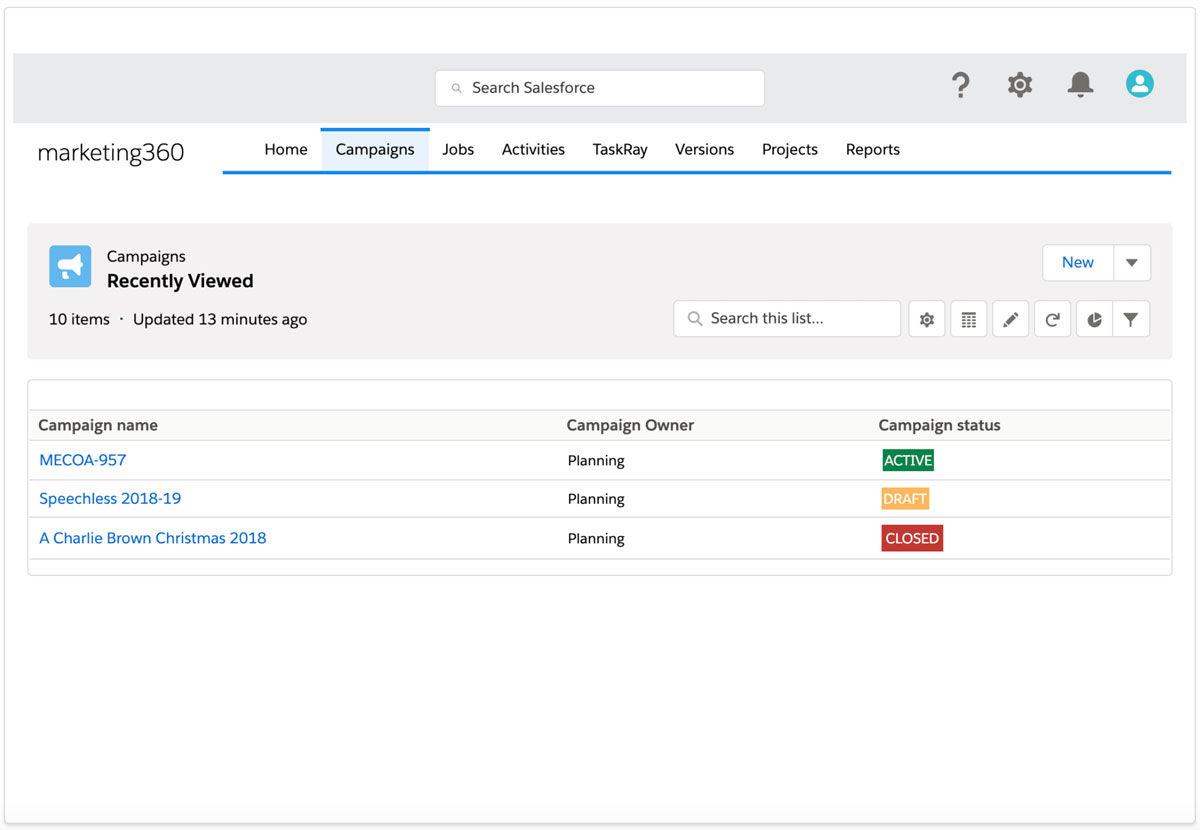
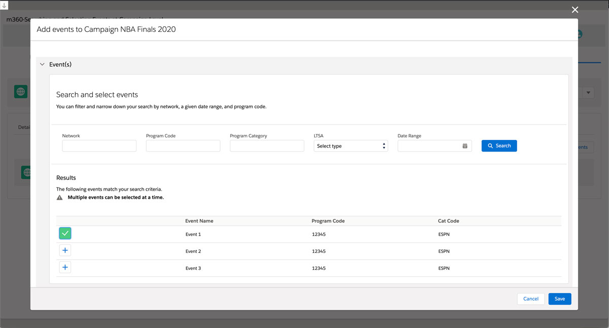
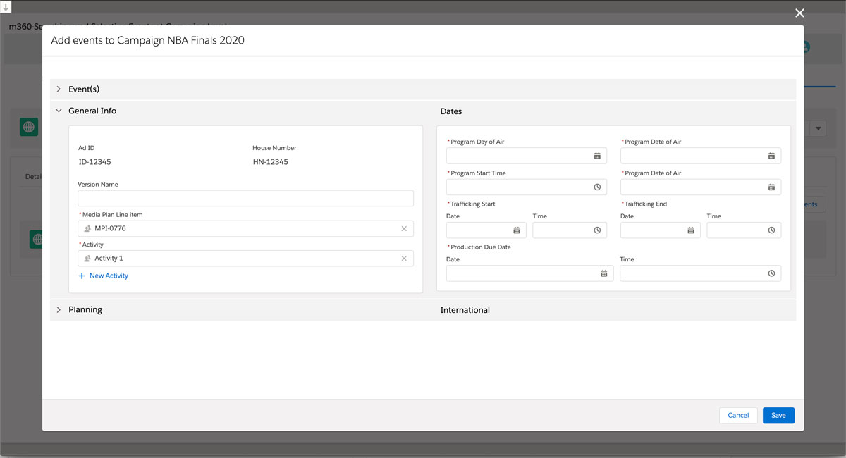
We not only simplified the way users look at the primary information to make day to day decisions but also provided a series of components that streamline the way users create and access records related to their marketing operations.
The impact
Improved the overall collaboration and transparency between teams and brands across Disney Teams.
