Commercial Real Estate Listing and Searching
The Design Process of a Real Estate Two-sided Marketplace
The Design Process of a Real Estate Two-sided Marketplace
DISCLAIMER: To comply with my non-disclosure agreement, I have omitted confidential information when writing and sharing this case study. All information is my own and does not necessarily reflect the views of the Comercialise Team.
Designing an easy to use self-service platform where brokers can list and promote their properties.
2020
How to make the process of listing and searching for offices, warehouses and commercial properties easier?
My role consisted of advising and guiding the Comercialise Product Development Team through the early stage validation process of their idea.
The Product Development Team already provided the user insights that came out of a previously conducted workshop where they were able to pinpoint user pain points and motivations. And with only 2 months to define a Minimum Viable Product to test out in the market, I needed to quickly validate and execute design ideas.
The first step of the design process consisted of reframing the identified user problems into design questions. This served as a foundation for the ideation session. After that we prioritized the ideas and once the team reached out a common agreement I proceeded with wireframing and prototyping a rough first solution to validate with brokers.
We then performed a testing session with brokers where we quickly gathered meaningful feedback and recommendations related to the usability and information requirements. These early results and recommendations guided us through the rest of the design process where we involved both brokers and brands. The process consisted of designing a higher fidelity prototype to test out with broker and users.
The tools, artifacts and methodologies used to deliver the tasks and challenges at hand.
The Product Development Team and I recapped on the motivations and pain points from their previously conducted workshop.
Broker: This user’s main job is to get his clients properties listed and rented/sold in order to earn a juicy commission. He needs to have a streamline way to list properties and have accurate information related to the listing in order to make decisions that influence the listing closing.
Brand/demand: This user requires to find a suitable space to allocate his business. Part of the information they find important are:
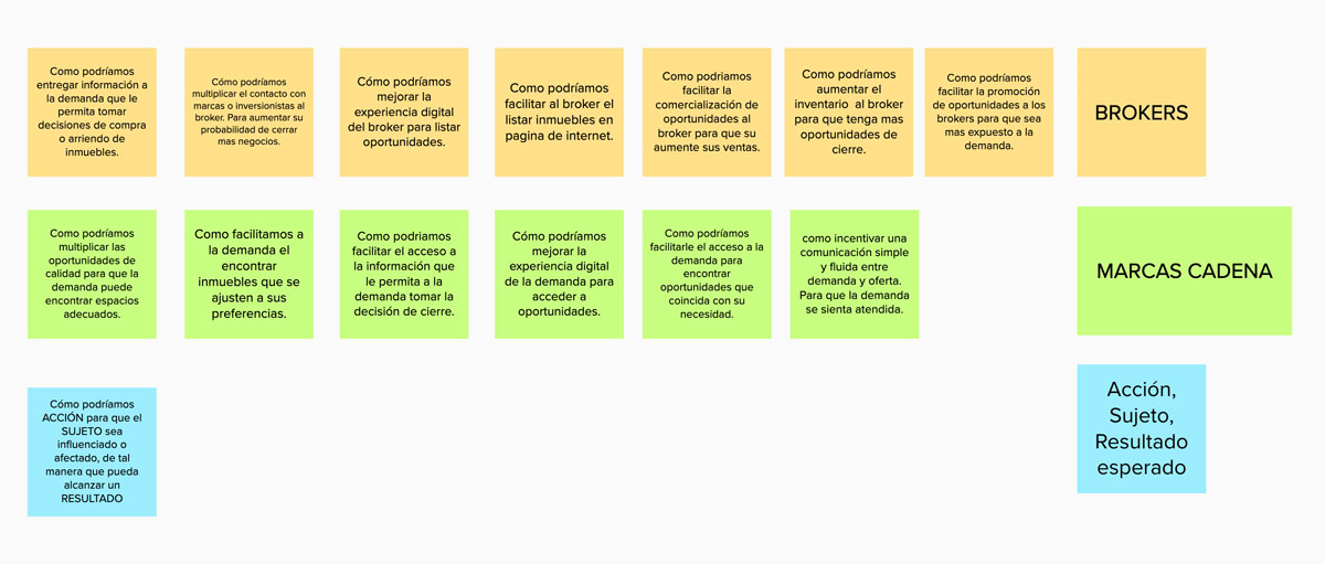
I guided the Product Development them to think on behalf of the user real needs, by flipping the user pain points and motivations into How Might We questions. The design questions were posted on a Mural canvas where we were able to gain a quick overview of the design challenges ahead.
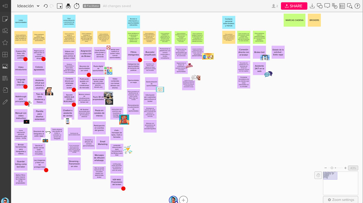
We came up with a handful of ideas for each How Might We question defined. We then proceeded to prioritize the ideas within the context of designing a MVP by performing a quick voting session.
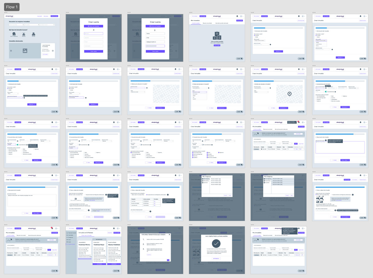
I designed low-fi wireframes that serve as the base to produce the prototypes to be used during the testing and validation session. The workflows we targeted were:
We conducted an early testing and validation session with 7 users who fit the Broker profile.
Each user was exposed to the prototype and provided with a series of tasks and pretty basic instructions. Users were encouraged to think out loud and express how they felt when trying to complete each task. Each session was recorded for further analysis.
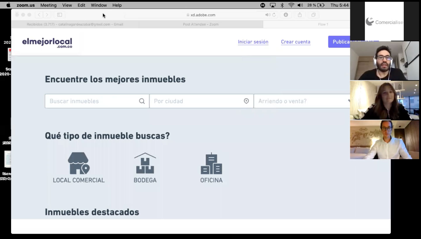
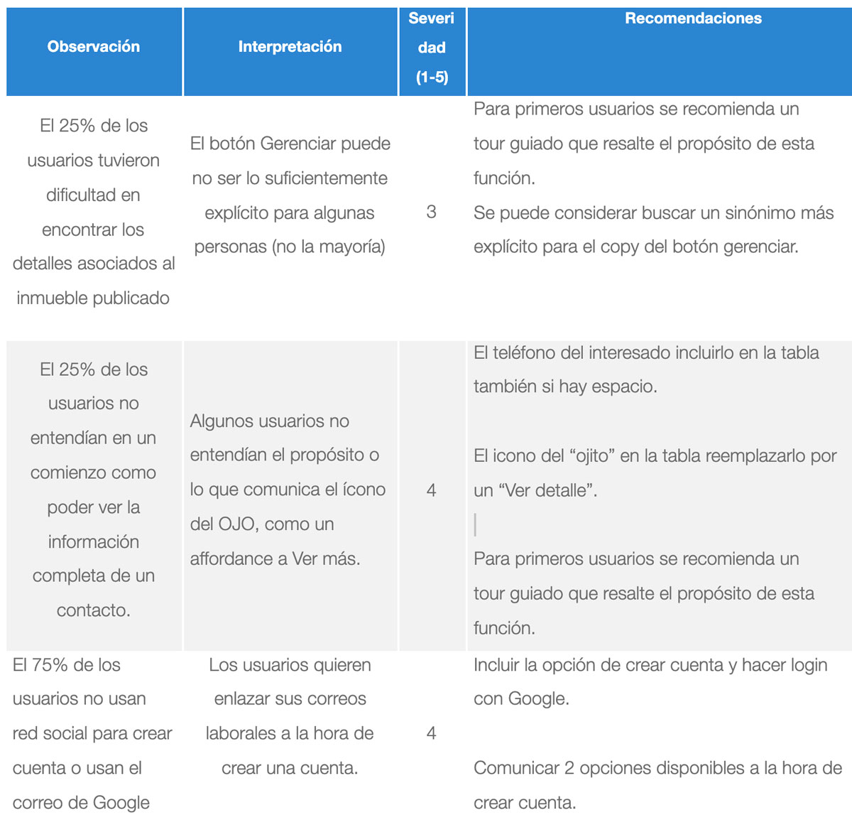
By checking and analysing the recordings we quantified the observations.
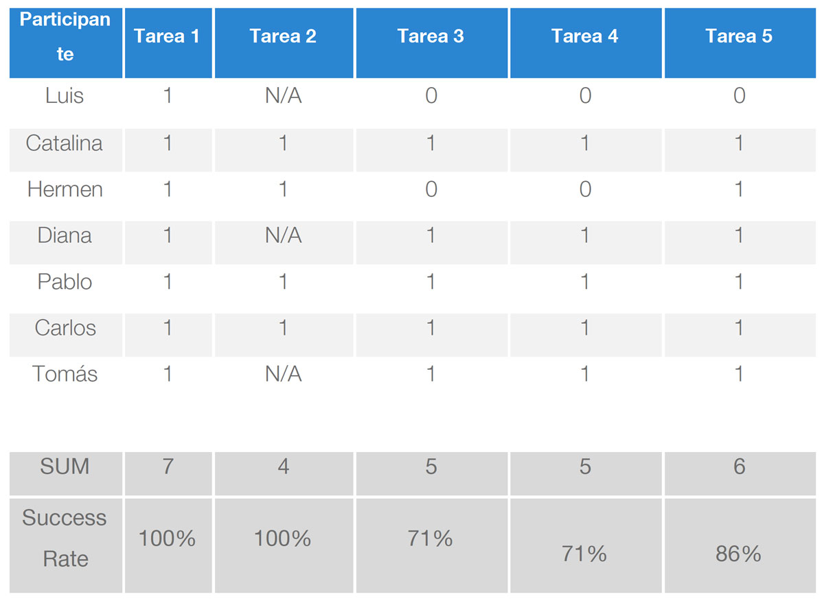
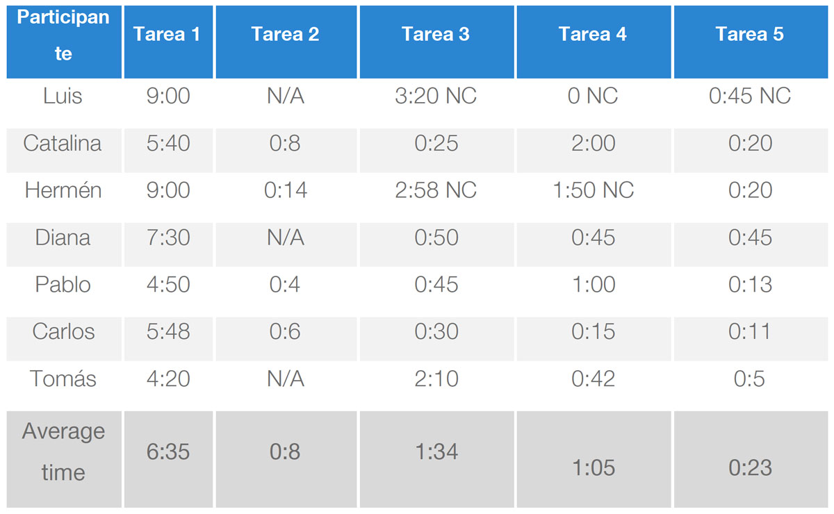
Errors are pinpointed to highlight areas for improvement.
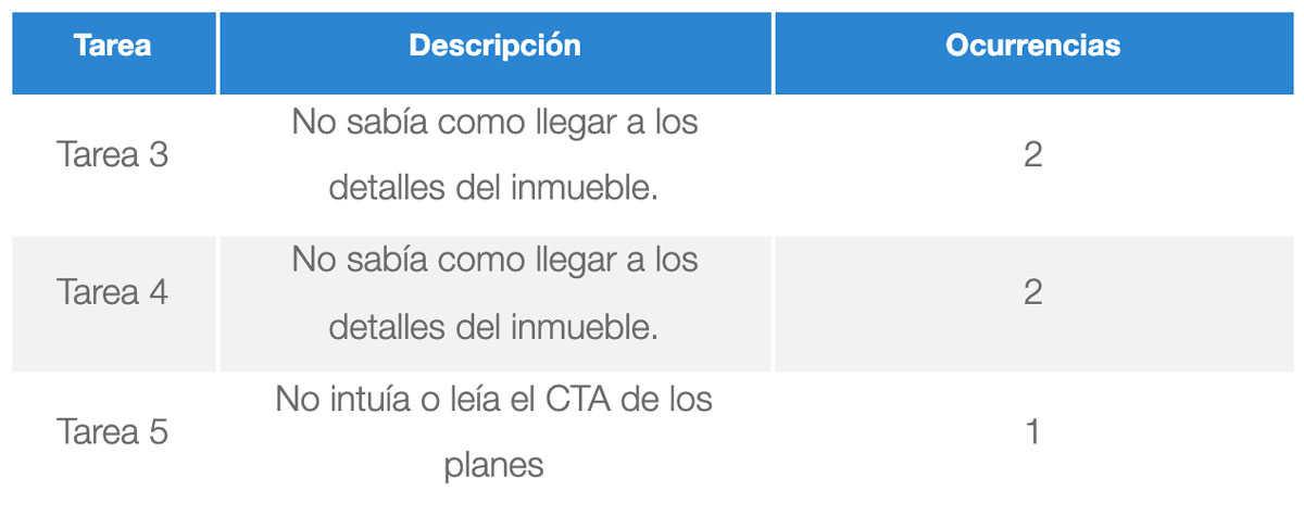
Based on the quantitative and qualitative analysis that came out from the testing sessions, I provided a series of recommendations for the next iteration.
Based on the outcomes and recommendations from the first iteration I improved the property listing and management flow and added the aesthetic details to each screen.
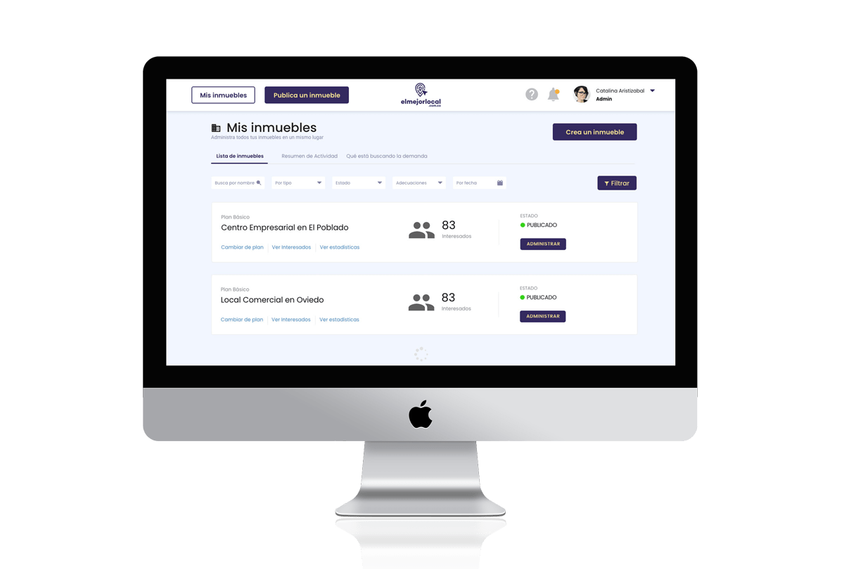
Brokers need a quick an easy way to navigate through their listings and check more in-depth information. I designed an on boarding solution to quickly get a broker up to speed on how to access and publish their property listings.
I introduced a step by step guided property listing process. One step at a time. If the broker is in a hurry or can’t simply complete the task at hand he can save his progress and continue later on.
Metrics and key actionable information is easily accesible from the Property Dashboard.
The demand (or searcher for that matter) requires an easy to find yet detailed property look up when navigating through listings.
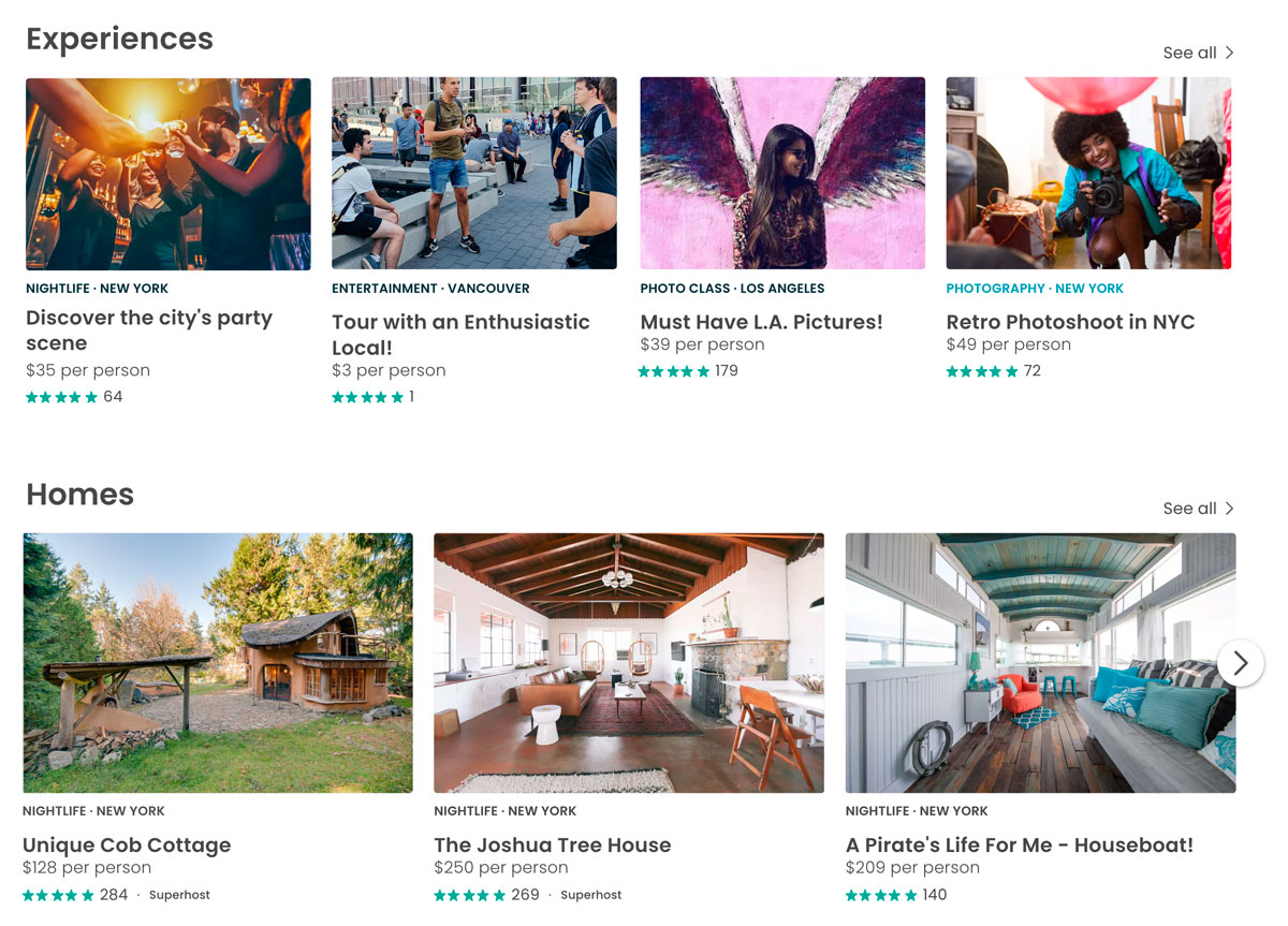
I conducted a quick benchmark and reference analysis and figured that the airbnb website includes some design patterns that could come in handy and were relevant to our context. As inspiration, I used the AirBnB’s property search and listing patterns as a reference to include on my designs.

AirBnB includes the most important information under their featured listings. They also provide quick access to featured listings on the homepage by categories.
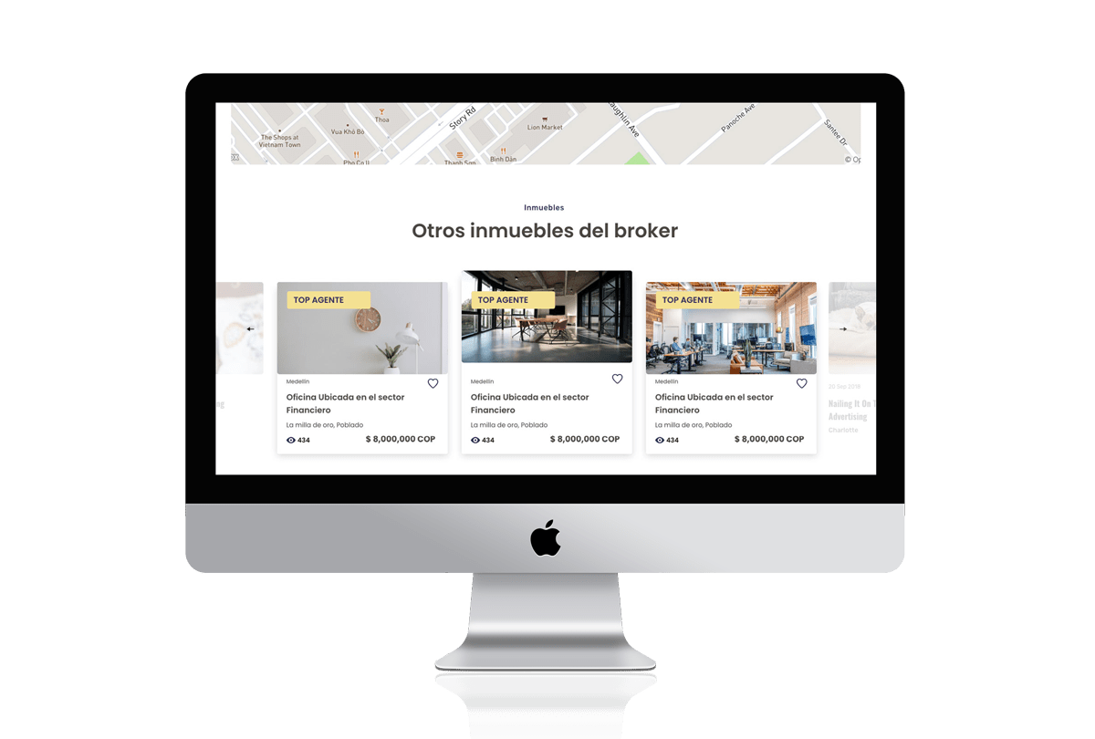
Properties can be searched from the Homepage. Featured properties are highlighted as well. A more in-depth search can be performed featuring a real time map that highlights properties that match the search criteria.
The key decision making information about the listing is highlighted on the screen threshold. Searchers need a personal connection and seal of trust if they can see a person behind the listing, so we included a section where the broker information can be easily accessed.
The broker reputation is a definitive factor that drives the demand’s decision of leasing or renting a property. I included a landing page devoted to showcasing the broker’s background and latest reviews. The broker can be contacted on this page.
The Client provided a brand guideline which I used to design the UI, and added one extra color to complement and enhance some actions.
#342960
#f4e192
#fb8f67
Chose a simple to read font family that works well across devices.
Thank you for taking the time to learn more about this case. If you liked this work, make sure to show your appreciation by sharing this content.