Simplifying event management
Unveiling and delivering new features for Event Managers
Unveiling and delivering new features for Event Managers
Sympla is Brazil’s Top event management and online platform that connects people with unique experiences. As market leader it holds the biggest events number of Brazil, featuring all types of events for every type of person.
2014
Events of all types and sizes have their fair share of difficulty during the entire event life cycle. Sympla’s value proposition is to equip event managers with the right tools to stay ahead of the game and provide a seamless and frictionless event managing experience.
What features made more sense to build, given that every event manager had different needs according to the niche they serve?
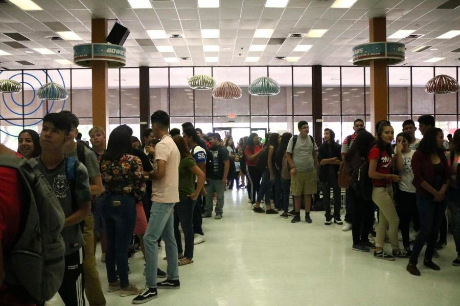
My role consisted of observing and uncovering event managers thought process to figure out what their pain points and motivations were when managing their events, and define a set of new product features to solve and tackle those uncovered needs.
Tools, artifacts and methodologies chosen for the task at hand.


By observing event managers doing their day to day work I was able to uncover their behaviors, pain points and motivations. Then I categorized the observations into different themes and silos of information. After that, I brainstormed potential features that meet the uncovered needs.
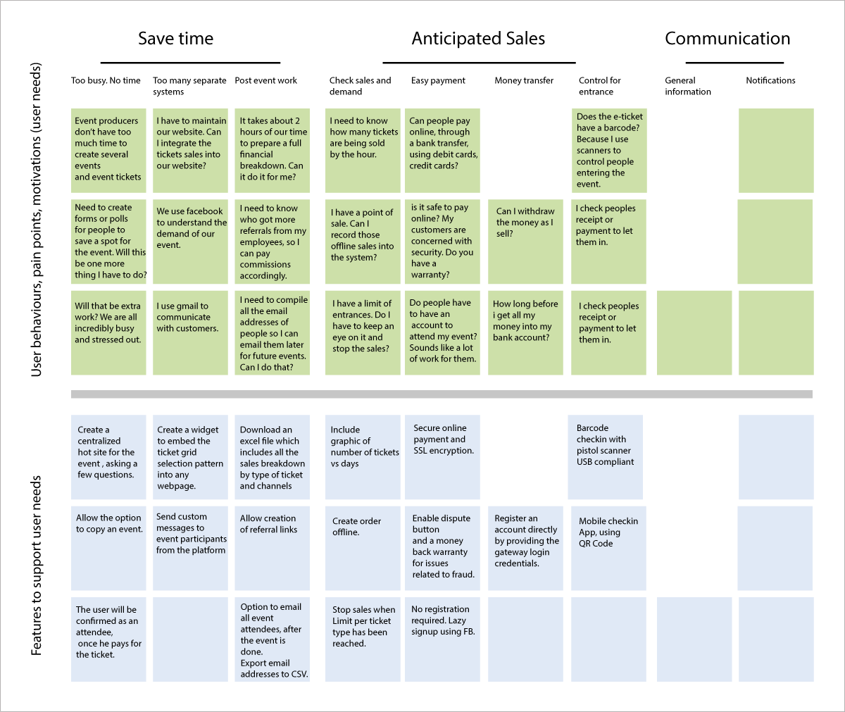
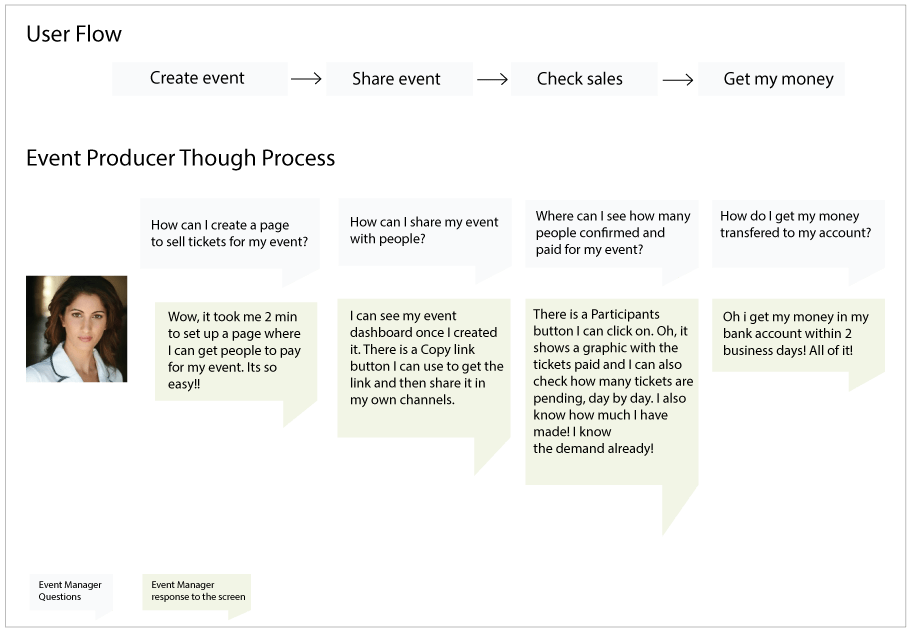
Mapping out the event manager thought process unveiled ways where the current Sympla’s self-service experience could be improved. This thought process provided more insights as to which features could be potentially put into the product backlog.
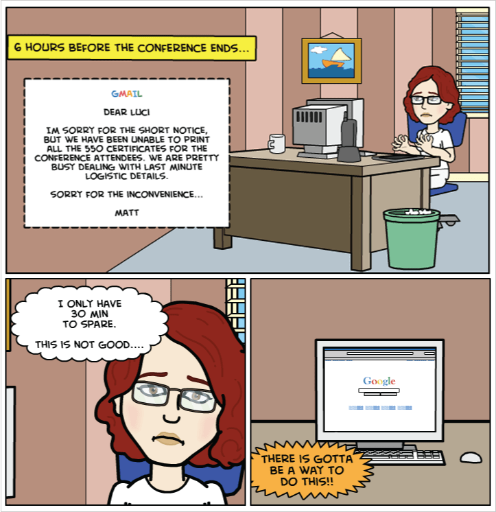
I constructed a point of view based on the event manager uncovered needs. Then I illustrated every user’s needs into separates comic book storylines which helped to amplify the user’s problem and helped the product team to easily empathize with the event manager situation.
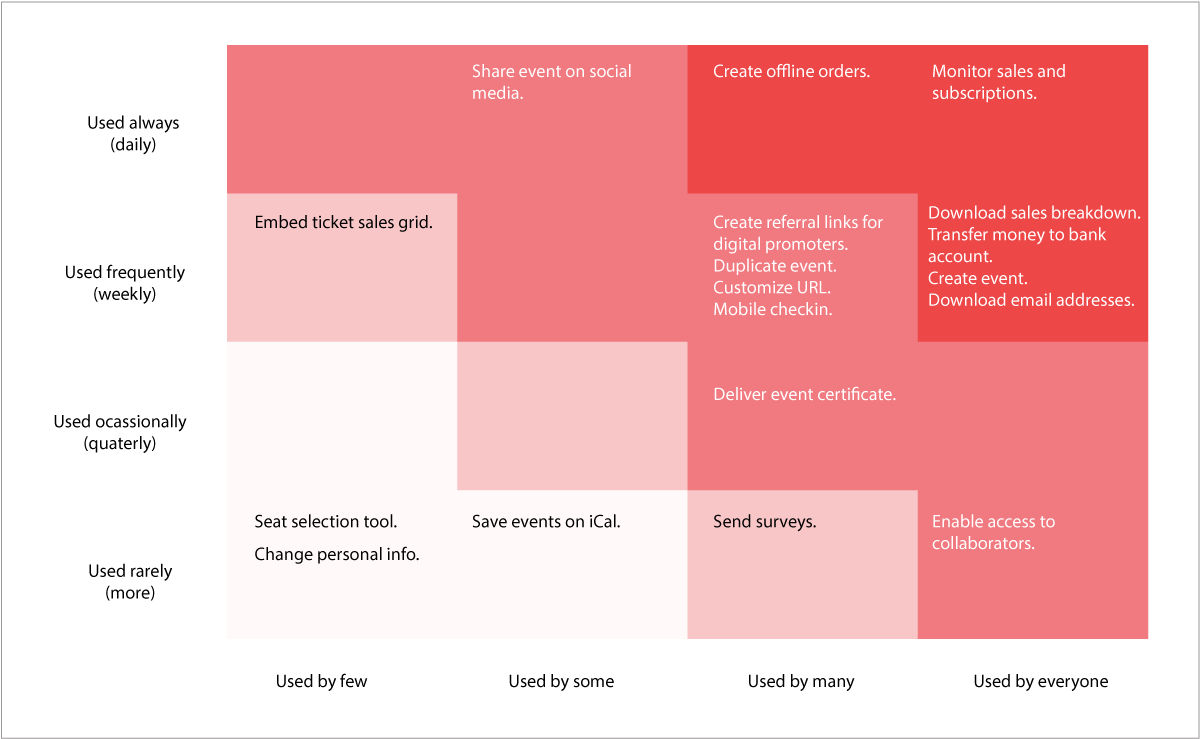
To avoid excessive feature bloat I guided the product development team through a red route analysis workshop to help us as a team determine which features are more important to ship in the short term.
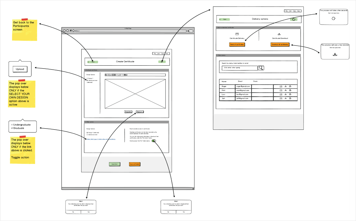
Once the team reached an agreement as to which features to implement I mocked up the desired functionality. Provided the details for each interaction and the expected outcome.
Based on the wireframe and interaction validation I moved forward with the aesthetic details for selected features.
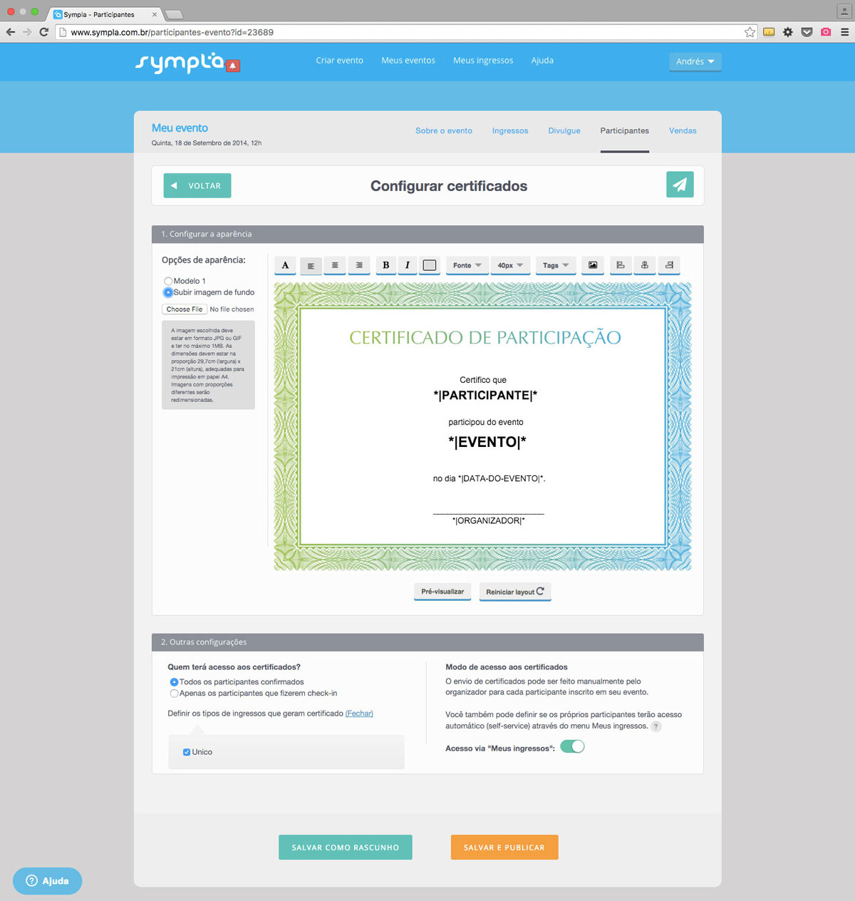
Event managers can easily personalize their event attendance certificates that attendees receive upon event completion.
Event managers can also define the best way to deliver the certificates by either downloading all of them in a printing batch or delivering them via email.
Features such as online checkin, manual order and post-event email blast were also designed and shipped.
Sympla was awarded the Spark Awards in 2015 for Startup of the Year