Event booking on Mobile web browsers
Enabling users to book tickets to their favorite events on the go
Enabling users to book tickets to their favorite events on the go
Sympla is Brazil’s Top event management and online platform that connects people with unique experiences. As market leader it holds the biggest events number of Brazil, featuring all types of events for every type of person.
2014
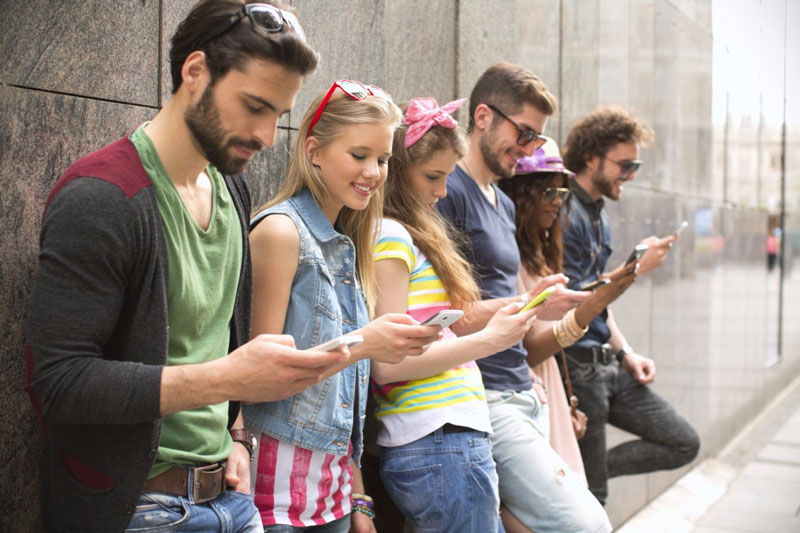
The ever-increasing mobile device adoption changed the way consumers buy online. At the time (back in 2014) Sympla didn’t own a mobile app nor they had at least a responsive website that could allow users to navigate the website and still search for and book event tickets.
I was assigned with the task of designing a fully responsive website that works on every major mobile phone.
The tools and artifacts chosen for the task at hand.


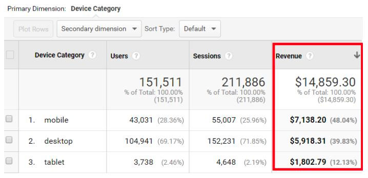
By analizing and tracking Google Analytics key metrics we were able to confirm our initial hypothesis of larger numbers of traffic via mobile devices, and we needed to capitalize on this increasing trend.
Coding for larger screens is often more complicated than coding for smaller screens. This is why coding using a mobile first approach helped us simplify our code and extend the same functionality across devices, without compromising the already existing user experience.
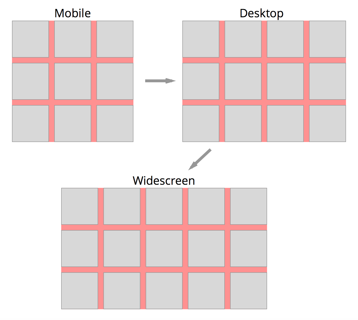
Designing and coding with a Mobile-First approach in mind let us adapt the existing user flows to multiple viewports and devices, without compromising the already existing and functioning experience on desktop or larger screens.
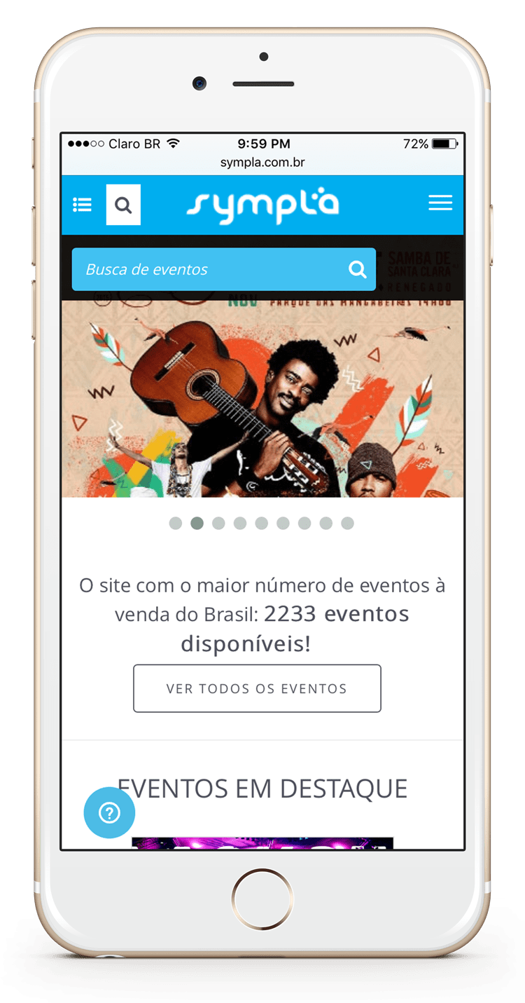
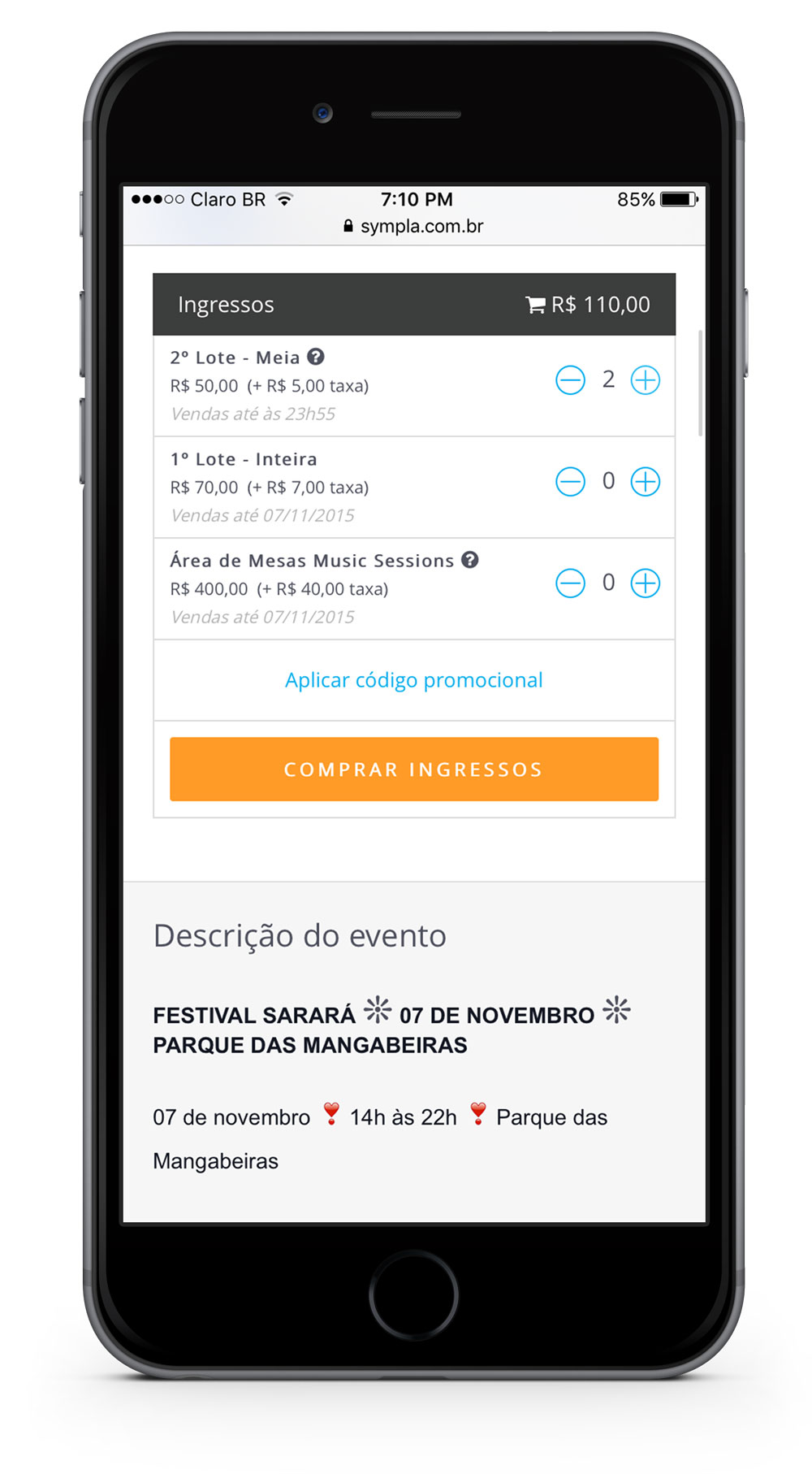
Searching, booking and paying for tickets was possible on every major screen.
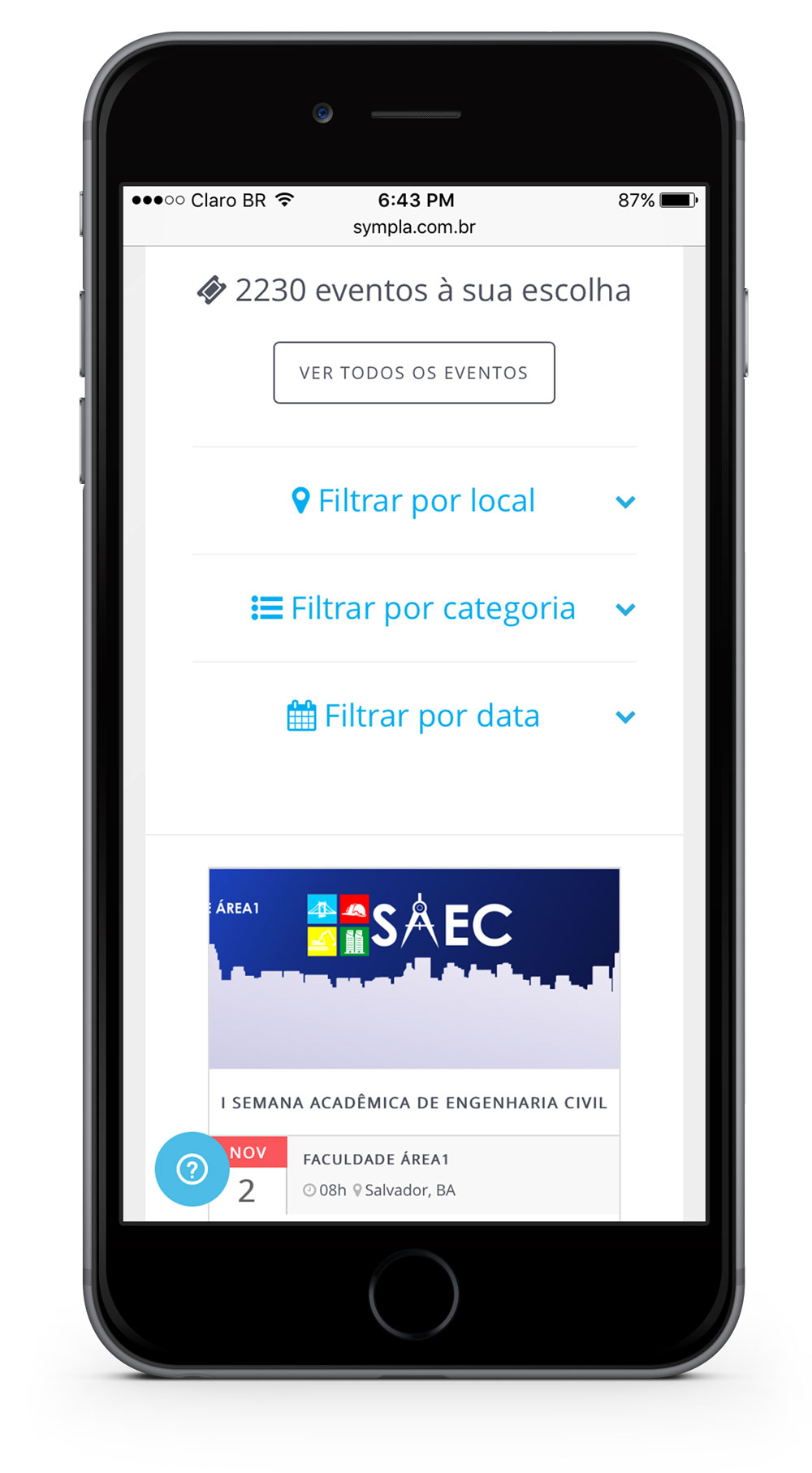
Filtering and narrowing down events based on personal preferences is convenient and works using mobile interaction patterns.
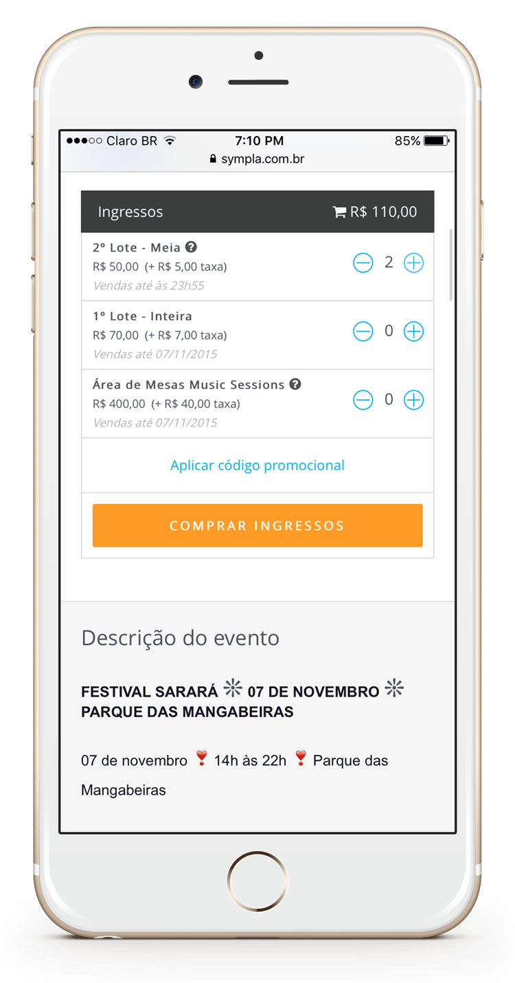
Adding or removing as many tickets as needed is easily done.
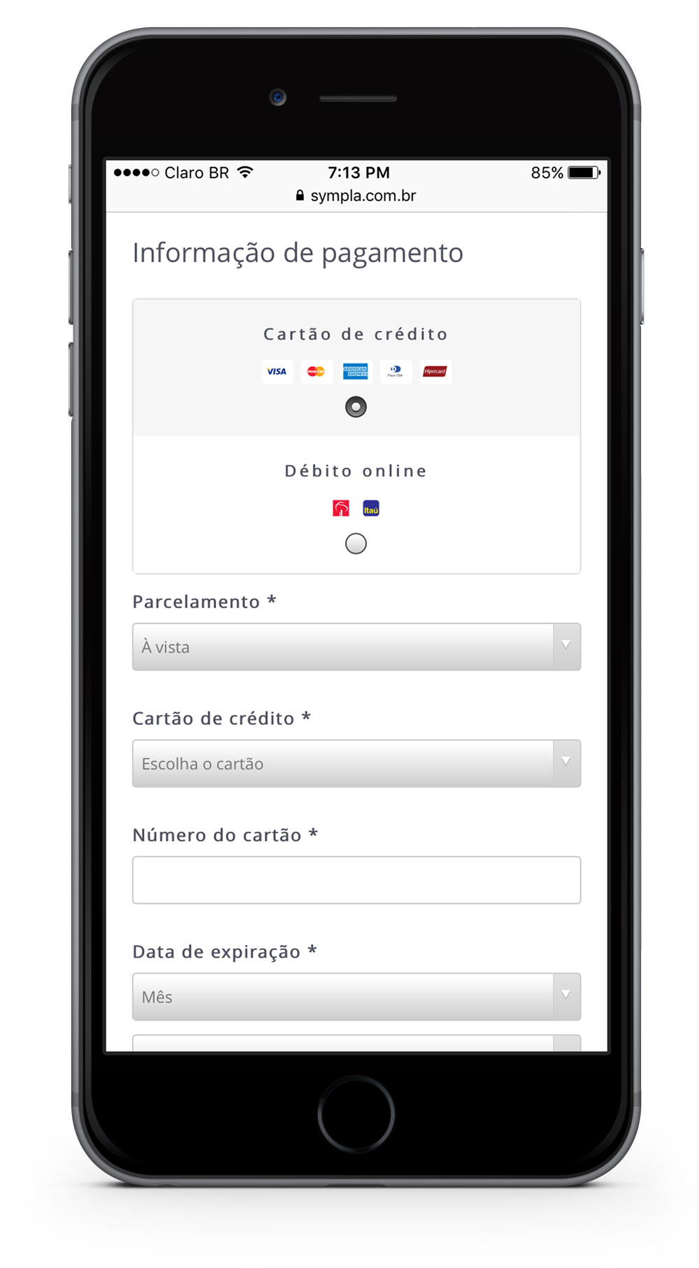
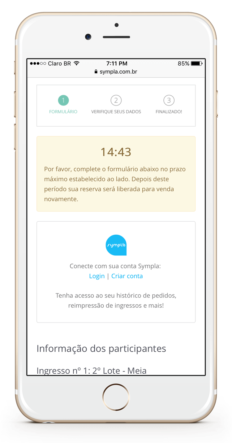
All the fields required to make a payment fit nicely on the mobile layout.
The desktop event searching counterpart is extended on wider screens.


The same holds true for ticket payment. The user experience is even enhanced on wider screens as a new responsive layout replaced the previous desktop first design approach.

